top of page
COLLAB
Individual
project


BRIEF
The, back then, emerging Costa Rican brand of craft beer 'Fondo Blanco' faced a pressing need for a distinct and memorable visual identity across its various brand applications, including packaging, promotional products, and social media posts, among others.
PROMOTIONAL PRODUCTS
2017-2018 | WORK PROJECT
CLIENT
Fondo Blanco,
active from
2016 to 2018
ROLE
Graphic, branding and packaging designer
TECH
Adobe Illustrator
Solid Works
Laser cutting machine
GOALS
• Translate Fondo Blanco’s local, eco-friendly, and handcrafted values into the new promotional products.
• Expand Fondo Blanco’s client reach and engagement through the new promotional products.
• Maintain a low-cost budget for the promotional products.
CHALLENGES
The main challenge of the project was, firstly, maintaining an updated image for the brand while preserving its traditional, handcrafted, and local values. This involved not only captivating users with the richness of the beer’s palate but also ensuring that the visual representation across all mediums was engaging and aligned with the brand's identity.
Secondly, proposing more compelling options to the brand that still matched its handcrafted side while maintaining a low budget was essential. This was particularly important since Fondo Blanco was an emerging local brand.
PROCESS
The sketching stage initially led to functional and economic solutions, which were valid options, but they somehow didn’t quite fit the essence of the brand for me. Eventually, it became clear that a standardized design wasn’t going to cut it, and that I would need to return to understanding the brand's core values.
It all clicked then: it was necessary to use their handcrafted and distinct nature as a baseline to create something out of the ordinary. This meant choosing more “raw” materials, designing different silhouettes that helped display the main product and stepped out of what’s normally used on the market, and adding a little extra handcrafted effort.
USERS & NEEDS
The target users for the brand were mainly beer enthusiasts and connoisseurs, as the products aimed to be high-end and rich in flavor. After that, the brand wanted to expand its reach to include all types of beer consumers.
OVERVIEW
Since the brand already had its initial brand image defined (logo and official bottle labels), it now required the expansion of both its promotional products and its visual communication materials (Click here to watch my visual design work with Fondo Blanco).
In this case, for the promotional products, the brand required some type of prize that could be gifted in social media giveaways, with the goal of reaching new clients and improving client loyalty and satisfaction. So, the initial proposal from the stakeholders was to give away a 6-Pack of their beers.
Skip process, jump to final solution →
SOLUTION
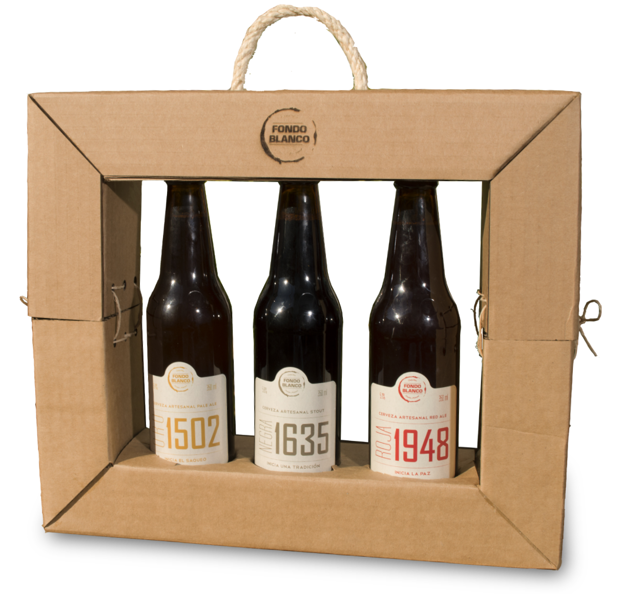
The initial idea of a 6-Pack was modified. The proposal ended up being something that felt like an actual gift and gave a whole experience of excitement to the winners of the giveaway when they opened it. The modifications were:
• Keychains: Since the idea of considering several promotional products had already been discussed, this addition was proposed. The keychains would be special extra gifts that could be used not only for this project but also given away on other occasions or even sold. They required manual labor, which reflected the handcrafted side appropriately, and their production was considerably low-cost. They were made with laser-cut cork and small glass bottles filled with the malts used in the beers, and they would be hidden inside the packaging as a surprise.
• To help lower expenses (considering the extra cost of the keychains), the material changed from traditional materials for primary packaging to a low-cost/reused material from the company itself: cardboard (they used cardboard for transportation, and eventually some could be reused). This material choice also helped promote the eco-friendly image of the brand, and the cardboard packaging was also laser-cut, which facilitated the speed of assembly and helped lower the costs of laser cutting (there were service discounts because of the amount of material, since the packaging and the keychains were a lot of material to cut).
• The last modification was reducing the products from a 6-pack to a 3-pack, again to help lower the costs of the project.


Research for inspiration > Sketching > Prototyping > Testing > Adjustments > Stakeholder check > Adjustments (if necessary) > Final design

First sketch proposals for both 6 packs and 3 packs.
FINAL PRODUCT
The 3 Pack was used in several giveaways, in both Fondo Blanco's own giveaways and in collaborations with other brands.

Social media's stories posts designed to promote the key chains.
bottom of page
